Ah, Apple. The tech giant that everyone loves to love…or love to hate. They’ve given us some amazing products over the years, but let’s be real, they’ve also given us some duds. Here are 10 Apple design that have been criticized as bad design, and how Apple has responded to the criticism.
1. Hockey Puck Mouse
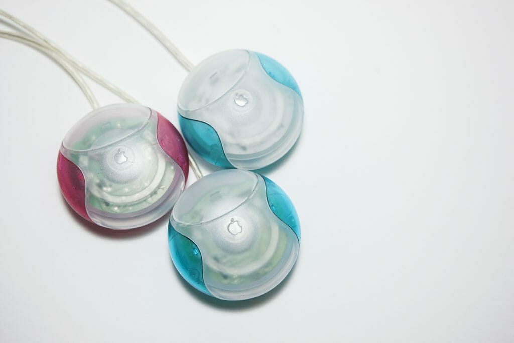
Remember the iMac G3? Of course, you do – it was the colorful, egg-shaped computer that took the world by storm in 1998. But let’s talk about the mouse that came with it – the Hockey Puck Mouse. This little guy was round, looked like a toy, and was notorious for being incredibly difficult to use. Users complained that it was uncomfortable to hold, and the small size made it challenging to navigate the cursor accurately.
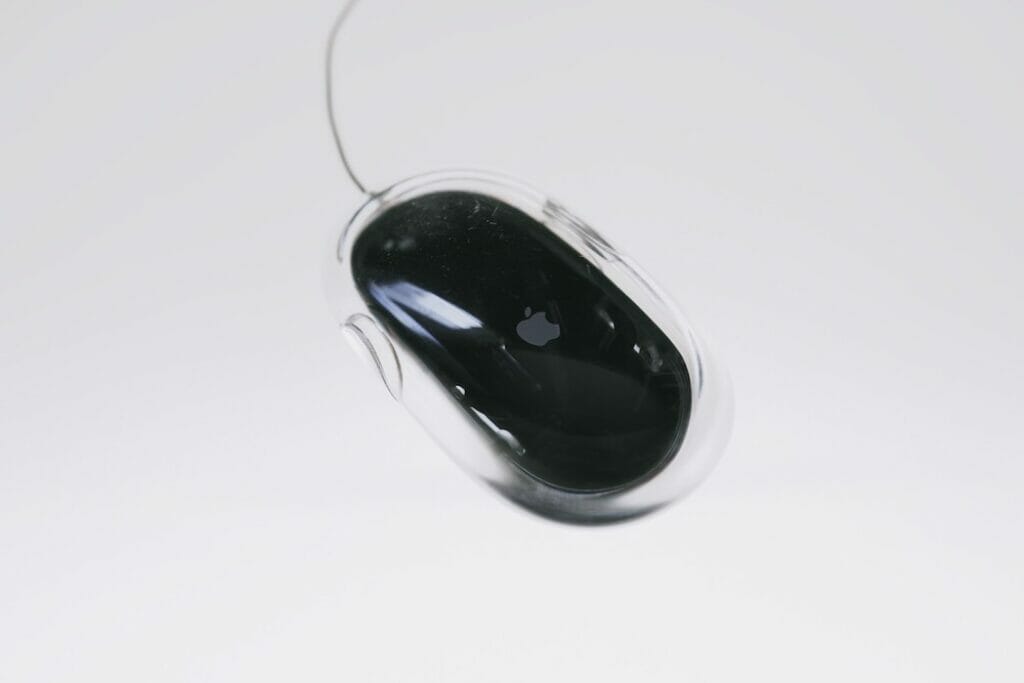
Apple fixed this design flaw by releasing a new, more ergonomic mouse in 2000. It was bigger, more comfortable to hold, and much easier to use.
2. MacBook Butterfly Keyboard
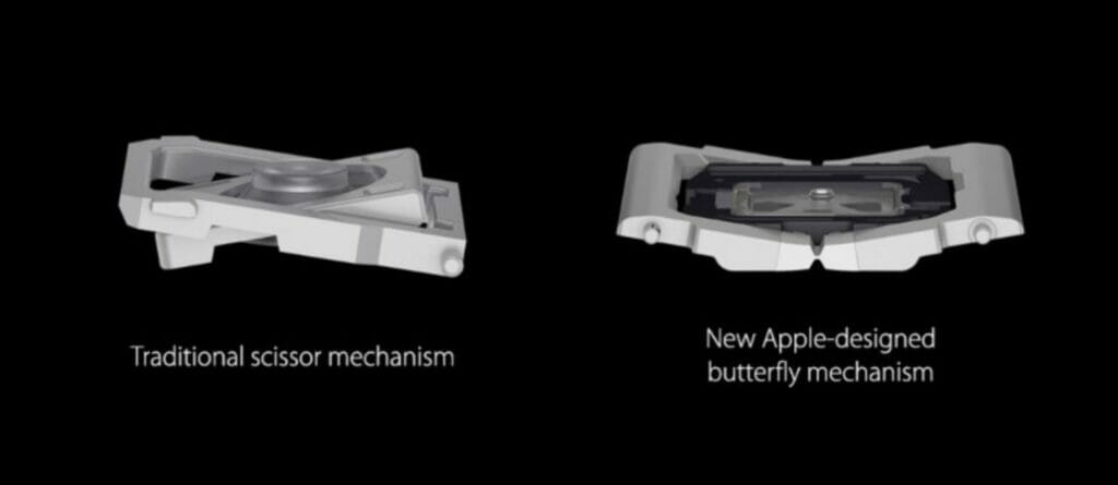
In 2015, Apple released the MacBook with a new “Butterfly” keyboard design. The goal was to make the keyboard thinner and more responsive, but users quickly discovered that the design had some serious issues. The keys were prone to getting stuck or failing altogether, which made typing an absolute nightmare.
Apple fixed this issue by redesigning the keyboard and releasing a new MacBook with a more reliable keyboard in 2019. They even apologized for the previous design and offered a free repair program for affected devices.
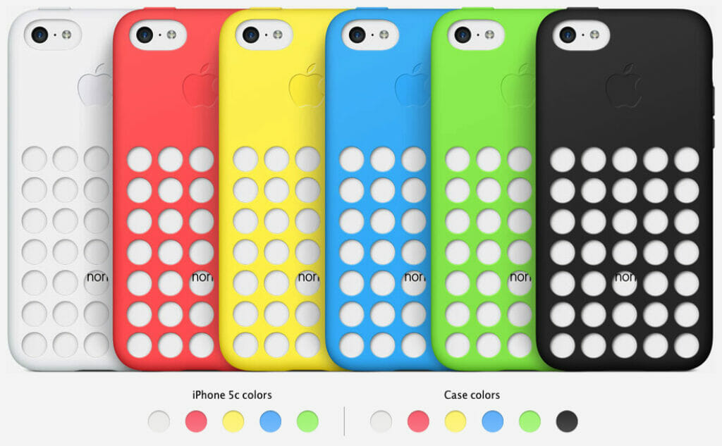
3. iPhone 5C Case
When Apple released the iPhone 5C in 2013, they wanted to offer a more affordable option for customers. The device came in a range of bright colors, and many people loved the design. However, the case that came with it was a different story. The case had a series of holes in the back, which allowed the color of the phone to show through. It seemed like a cool idea at the time, but users quickly discovered that the case was prone to getting dirty and was difficult to clean.
Apple fixed this design flaw by discontinuing the case and releasing a new range of cases with solid backs that were much easier to maintain.
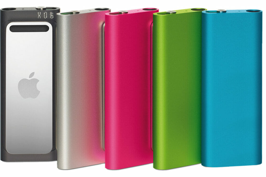
4. iPod Shuffle (3rd Generation)
Ah, the iPod Shuffle. The tiny music player that was perfect for those of us who wanted a no-frills listening experience. However, the 3rd generation of the Shuffle was widely criticized for its terrible button placement. The buttons were located on the earbud cord, making it difficult to use if you wanted to switch to a different set of headphones. Apple fixed this issue with the 4th generation Shuffle, which returned to a more traditional button layout on the device itself.
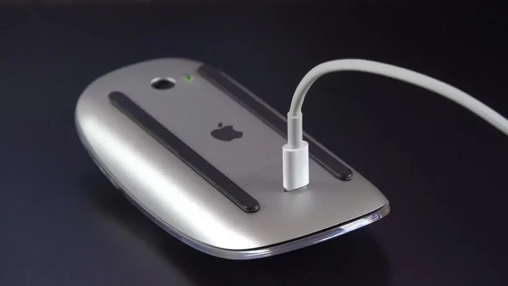
5. Magic Mouse
The Magic Mouse was a sleek and innovative device that allowed users to scroll and navigate with ease. However, the charging port was located on the bottom of the mouse, which meant that it couldn’t be used while it was charging. This was a major inconvenience for users who needed to use the mouse while it was charging.
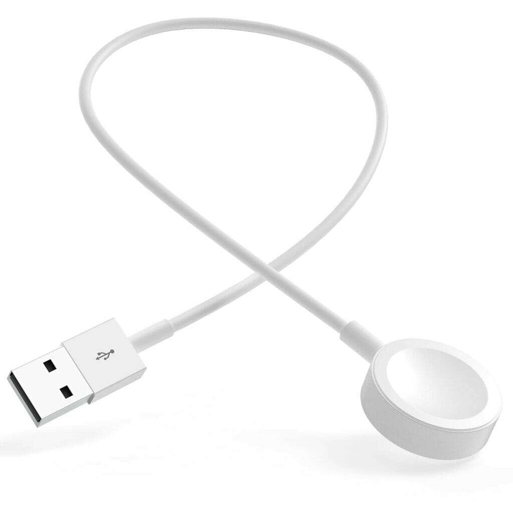
6. Apple Watch Charging Cable
The Apple Watch was a game-changer in the world of wearable technology, but the charging cable was a different story. The cable was short, which made it difficult to use while charging, and it was prone to breaking or fraying.
Apple fixed this issue by releasing a longer charging cable and a magnetic charging dock that made it much easier to charge the Apple Watch.
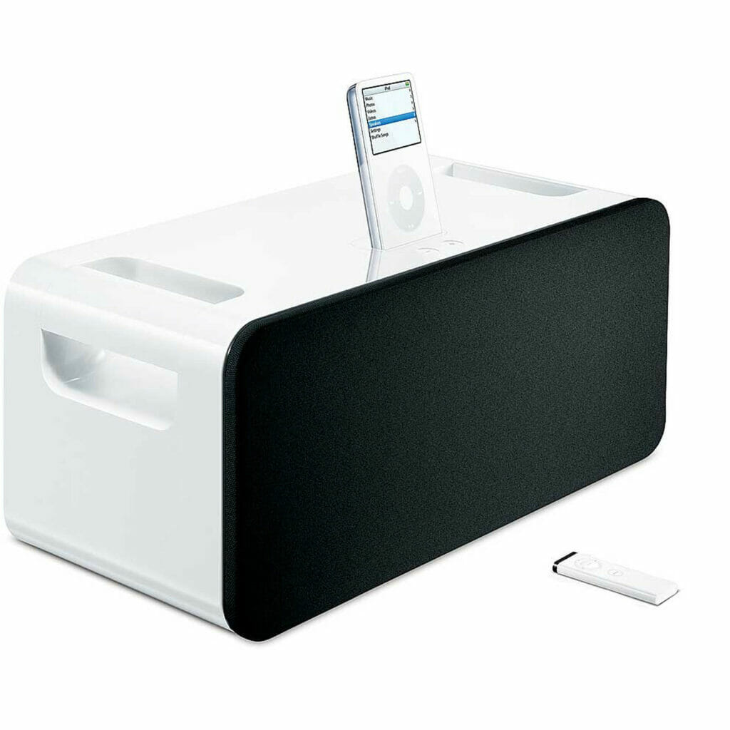
7. iPod Hi-Fi
The iPod Hi-Fi was supposed to be the ultimate speaker system for your iPod, but it ended up being a dud. Its design was uninspired, and it didn’t sound much better than cheaper alternatives on the market. But Apple didn’t give up on the idea of a high-quality speaker system for the iPod, and later released the HomePod, which boasts impressive sound quality and sleek design.
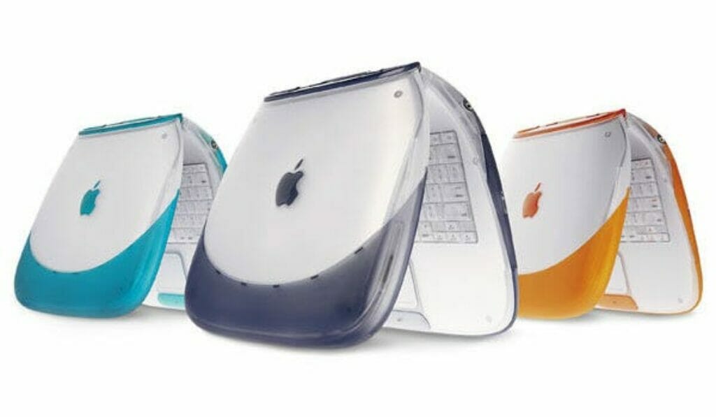
8. iBook G3 Clamshell
The iBook G3 Clamshell was released in 1999 and featured a bold, colorful design that was meant to appeal to a younger audience. But its bulky design and limited connectivity options made it less-than-ideal for students and professionals. It also lacked features like a CD burner, which were becoming increasingly important at the time. Apple addressed these issues with subsequent iBook releases, which featured slimmer designs and more advanced features.
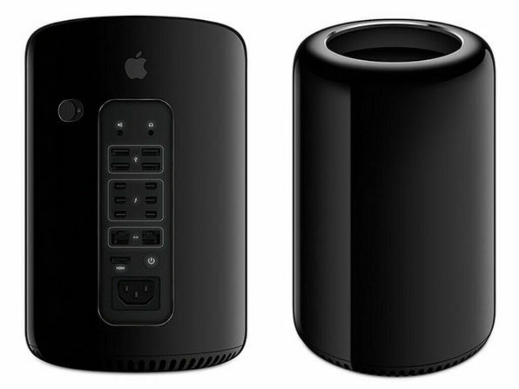
9. Mac Pro “Trash Can”
The Mac Pro “Trash Can” was initially praised for its unique, cylindrical design, but it was widely criticized for its lack of upgradability and limited connectivity options. Many professionals found it frustrating to work with, as they couldn’t easily upgrade components or connect to older peripherals. Apple addressed these issues with the redesigned Mac Pro, which features a more traditional tower design and improved specs.
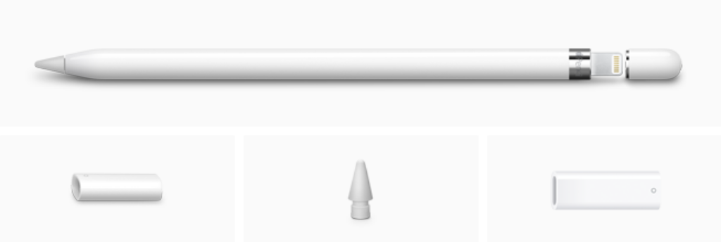
10. Apple Pencil (1st Generation)
The 1st generation of the Apple Pencil was criticized for its lack of storage options. There was no place to store the cap or the Lightning adapter, meaning that it was easy to lose those small parts. Apple addressed this issue with the release of the 2nd generation Apple Pencil, which magnetically attaches to the iPad Pro and features a new design that eliminates the need for a cap and Lightning adapter.
Apple may have stumbled a few times, but they always manage to pick themselves back up and try again. Whether it’s adding a protective silicone layer to their keyboard or giving away free bumper cases with their phones, they’re not afraid to admit their mistakes and make things right.
So here’s to Apple, the tech giant that never gives up. May they continue to innovate and push the boundaries of design, while also learning from their past mistakes


